SOM Website Improvements
From 2015–2019, I oversaw a number of significant updates to som.com as the Digital Content Team’s producer, strategist, and de facto website product manager.
Localization for audience in China
Clients in China have been key to SOM’s success for decades. But in 2015, SOM’s new website was only available in English. Facing a new generation of networked, internet-savvy clients and increased competition in the country, SOM invested in the creation of a localized, Chinese version of its website to support business development.
I worked with translators, developers, and company leadership to launch som.com/china. Meanwhile, I proposed and managed the implementation of a content delivery network and image compression system to optimize site speed for our users.
 som.com/china
Mobile revamp and UX upgrades
som.com was not optimized for phones or tablets when it launched in 2014. The website was stunted by a budget cut, leaving it to only work properly on desktop devices. My proposal to remedy the issue and meet growing user demand was approved in late 2015. I spearheaded the responsive redesign, managing all phases of the project with same agency that designed the desktop site.
I had recently completed a UX course at General Assembly, and used this project at SOM as an opportunity to apply my knowledge. Several pages and features of the website had to change to work on mobile, so I conducted user research, studied website analytics, and created wireframes and user flows to illustrate and recommend a new approach.
For example, our Contact page pinned all of SOM’s offices on a static, unresponsive map that hid information until the user hovered their cursor over a hot spot. That was easy to address, but the page also contained a form for users to contact each office via email. We found that users often did not know which office to contact, and this caused employees in each SOM office to receive and redirect hundreds of emails each day. Time was being wasted and both users and employees were frustrated.
To fix the issue, I surveyed each office to learn who was submitting these inquiries through the form, and what they wanted. I determined that there were five primary users: journalists, students, job applicants, vendors looking for new business, and potential clients.
Based on the needs of the form users and email recipients, the form was redesigned to:
– Shepherd the user through one of five funnels depending on their type of inquiry
– Automatically direct journalist and student inquiries about a project to the SOM office that designed it
– Label emails according to the type of inquiry, allowing recipients to easily sort and prioritize messages
– Funnel job applications through HR’s appropriate channels
 New, responsive som.com
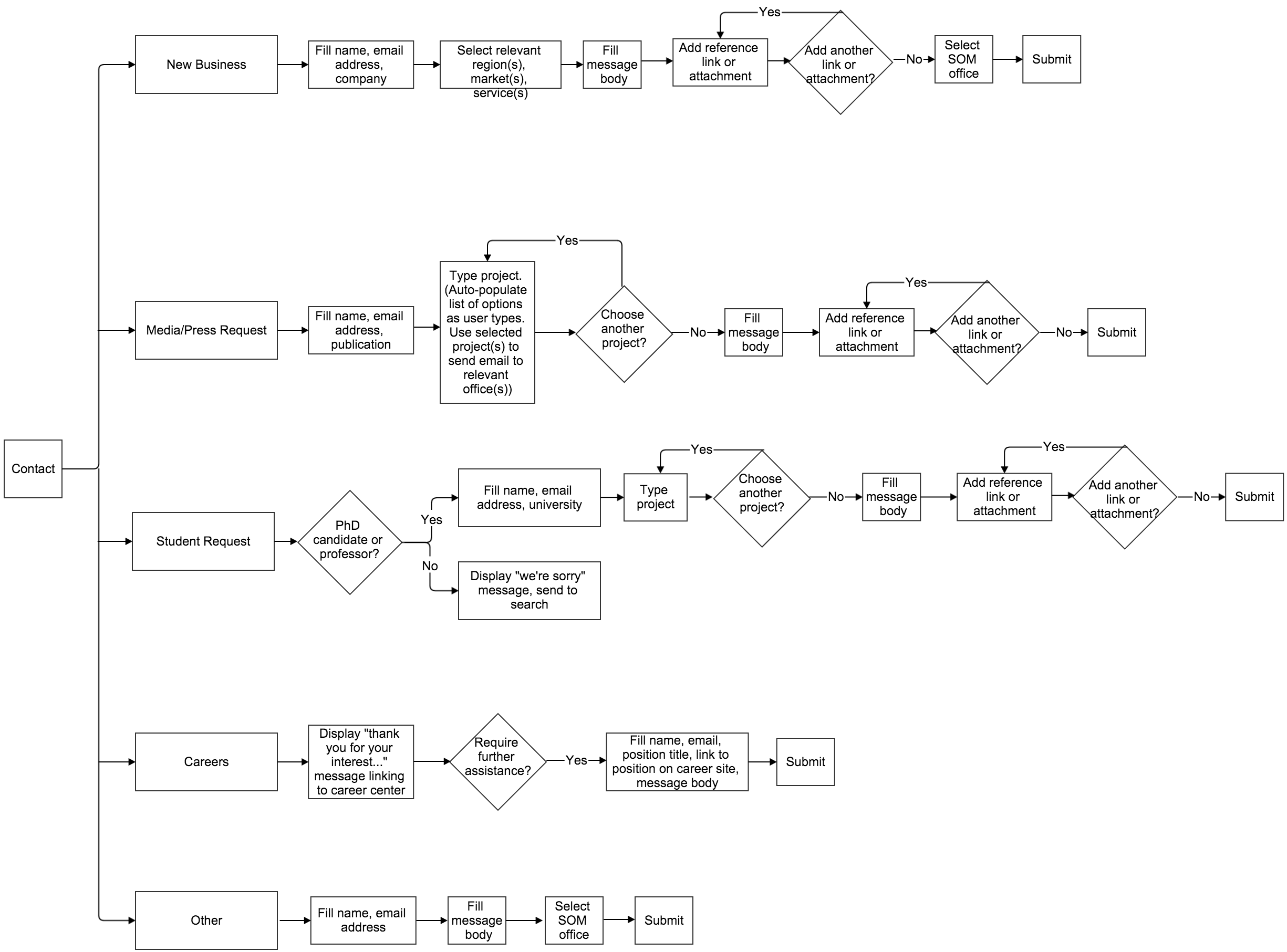 User flow for new contact form
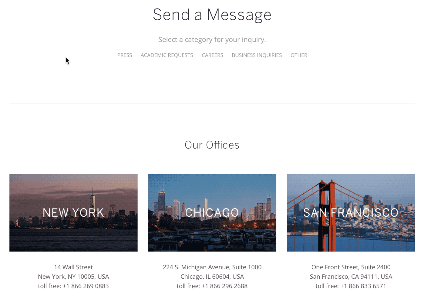 New contact form