DMV Reservation App UX Redesign
For my User Experience Design course at General Assembly, I redesigned the New York DMV’s core app for connecting users with its services: the reservation maker.
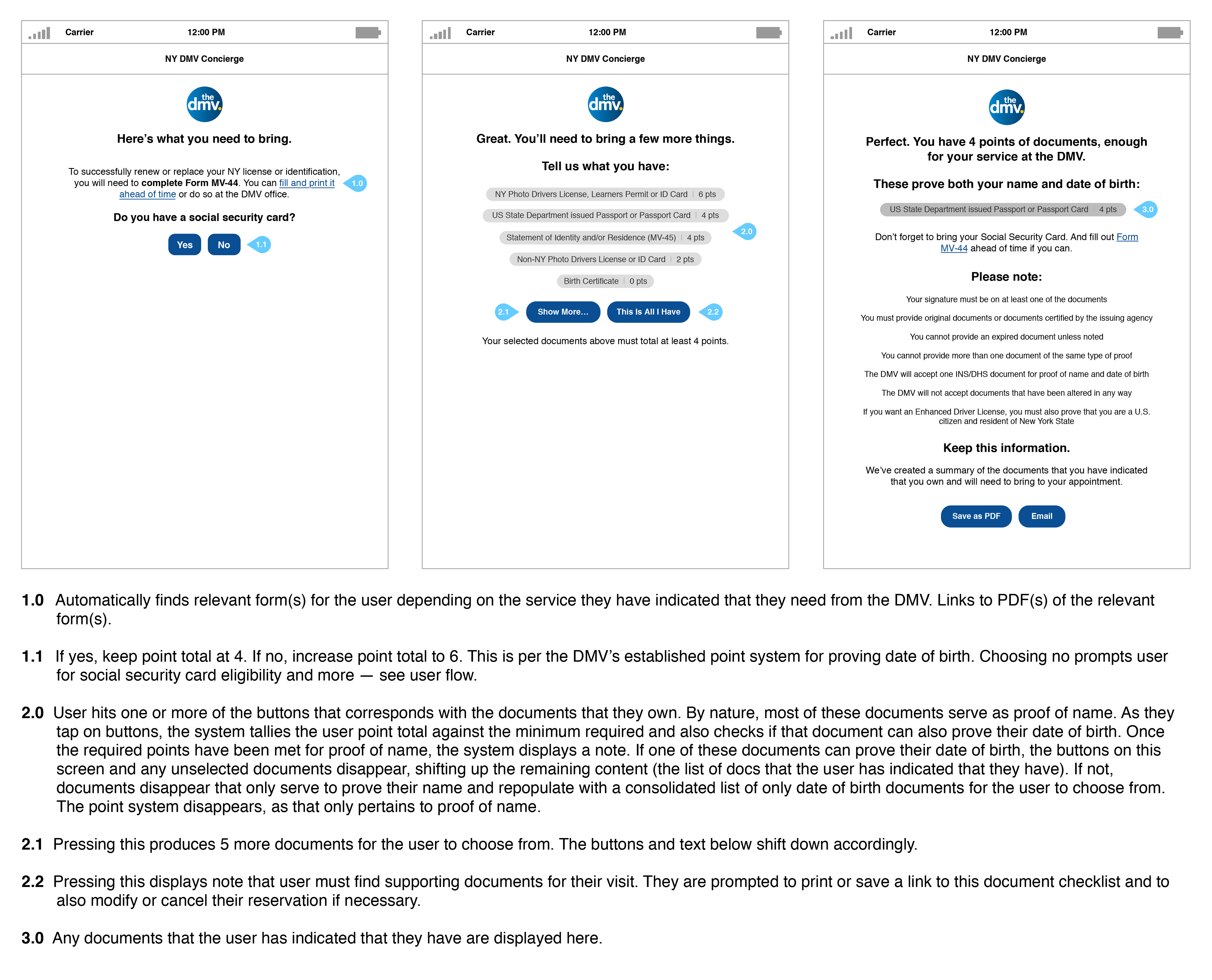
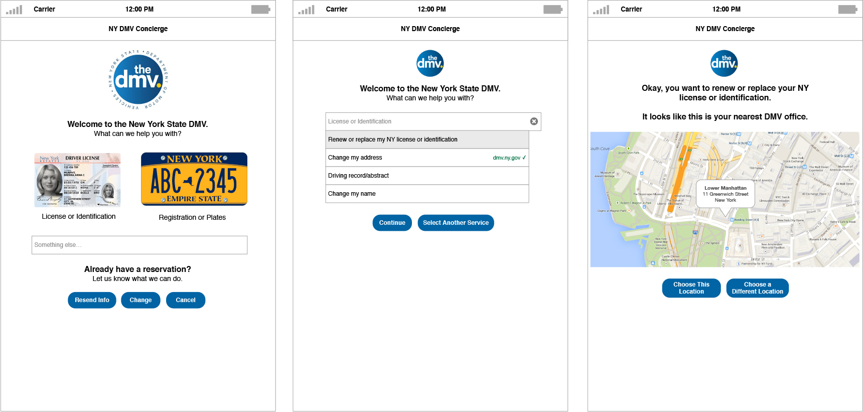 Wireframes for a redesigned New York DMV reservation app.
The Challenge
The Department of Motor Vehicles (DMV) is one of the most visible faces of New York State government, providing a wide range of essential services to millions of people every year. The agency also carries a bad reputation, earned long ago for consistently failing to meet basic customer service expectations.
Why? A 1993 article in The New York Times explains: “For years, the reasons for dissatisfaction have been obvious to anyone who visited a district office: endless waits, surly clerks, poor information and a bureaucratic system that often forces people to spend half a day on a transaction that might take only 15 minutes in another state.”
The agency was still plagued with many of these issues when Governor Andrew Cuomo was elected to his first term of office in 2010. Two years later, he acknowledged the problem and launched the DMV Customer Service Initiative, which promised to create a “fast, easy, and convenient” DMV experience. The DMV began providing online services as alternative to some office visits, and created a reservation web app to reduce wait times in their offices.
Unfortunately, the DMV’s reservation maker was imperfect at best. After a confusing encounter with the app, I was inspired to redesign it as part of my User Experience Design course at General Assembly.
Slow, difficult, and irritating: The customer experience at the DMV is a trope in American pop culture. Above: clips from Broad City and Zootopia (via Giphy)
Walkthrough of the existing DMV reservation maker
Understanding the DMV
Before I could form a product vision for the redesign, I needed to better understand the objectives of the DMV. I found that they wanted to:
- Reduce wait times at DMV offices from more than 60 minutes to 30 minutes or less.
- Achieve 90% customer satisfaction by customers who use a DMV office.
- Be a national leader in providing efficient, innovative, and responsive government services.
Understanding DMV customers
I also needed to learn more about the needs of New Yorkers who were using the reservation maker. This started with interviews, which revealed a number of key insights about the app:
Quantitative information on DMV user activity was also published on the agency’s website, which stated that the three most popular online transactions were:
- “It met expectations for a government service, but it doesn’t hold up to what I’m used to from businesses.”
- “I had to use Google instead of their website.”
- “I thought I had the documents that I needed, but I didn’t. When I showed up to the DMV, I was turned away.”
- “I think I wasted the same amount time on their site that I would’ve spent in line at the DMV.”
- “There’s no clear hierarchy or organization; all of this information bubbles to the surface.”
- “It’s just not intuitive.”
- “I’m not sure if I’m doing this right.”
Quantitative information on DMV user activity was also published on the agency’s website, which stated that the three most popular online transactions were:
- Registration renewals (1.8 million)
- Driver license, learner permit, or non-driver ID replacements (221,000)
- Driver license and non-driver ID renewals (128,000)
Based on this research, I created two user personas to help guide the product vision.
Natalie – Native New Yorker
Goal: Renew New York identification
Pain points:
Goal: Renew New York identification
Pain points:
- Feels that the information she needs is hard to find. And trying to understand it is taking up too much of her time.
- Isn’t sure if she can skip the trip to a DMV office and simply request a new license online.
- Believes that that the system could do more to help her through this process.
- The website says to call customer service with questions, but when she does, customer service says to reference the website.
Terri – New York Transplant
Goal: Transfer out-of-state license
Pain points:
Goal: Transfer out-of-state license
Pain points:
- Unclear which DMV office is closest that also provides this service.
- Isn’t confident that she has enough documents ahead of her visit.
- Has to do too much research in other areas of the DMV website (even resorting to Google at times) to understand what she needs to do.
- She doesn’t think that the reservation system lives up to the standards set by other technology.
Analogous Products
I also tracked down products that were similar to New York’s DMV reservation maker. At the time, only California, Florida, and Kansas had implemented anything similar, and none were as usable as New York’s app.
Moving on, I looked to the business sector for transactional apps that seemed to empathize with its user base, and found Virgin America’s new flight booking system. It was the first of its kind: a fast, responsive airline website that shaped a clear, straightforward path for the user. The product was laser-focused around a few key use cases rather than dozens. The UX was restrained, only asking the customer to make one decision at a time. And last but not least, there was no upsell for car rentals, hotels, or credit cards during the booking process.
I also found Apple’s Genius Bar reservation system to be similarly well-designed. The product was clearly focused around its objective: to connect users with a faulty Apple device to a specialist who could fix the issue. The booking process glided users through tight sets of options to select from, limiting their cognitive load to minimize the possibility of further frustration with the company. The app also helpfully suggested nearby Apple Stores where the user could book their appointment based on their current location.
Virgin America’s flight booking system
Apple's Genius Bar reservation system
Apple's Genius Bar reservation system
The Solution
The New York DMV’s vision is “to be a national leader in providing efficient, innovative and responsive government services.” To accomplish this, I proposed that the DMV redesign its reservation maker—a prominent interface between internet-connected New Yorkers and in-person DMV services.
The basic tool could be transformed from a utilitarian reservation maker for DMV experts into an app that helps the average New Yorker navigate the complexities of the DMV. I set out to redesign the app to help users understand:
By improving the app’s information architecture, navigation, forms, hierarchy, and structure, a clearer system with less friction could be produced. This would help New Yorkers get faster, easier access to the DMV services that they need, moving the DMV closer to its 90% customer satisfaction goal.
The basic tool could be transformed from a utilitarian reservation maker for DMV experts into an app that helps the average New Yorker navigate the complexities of the DMV. I set out to redesign the app to help users understand:
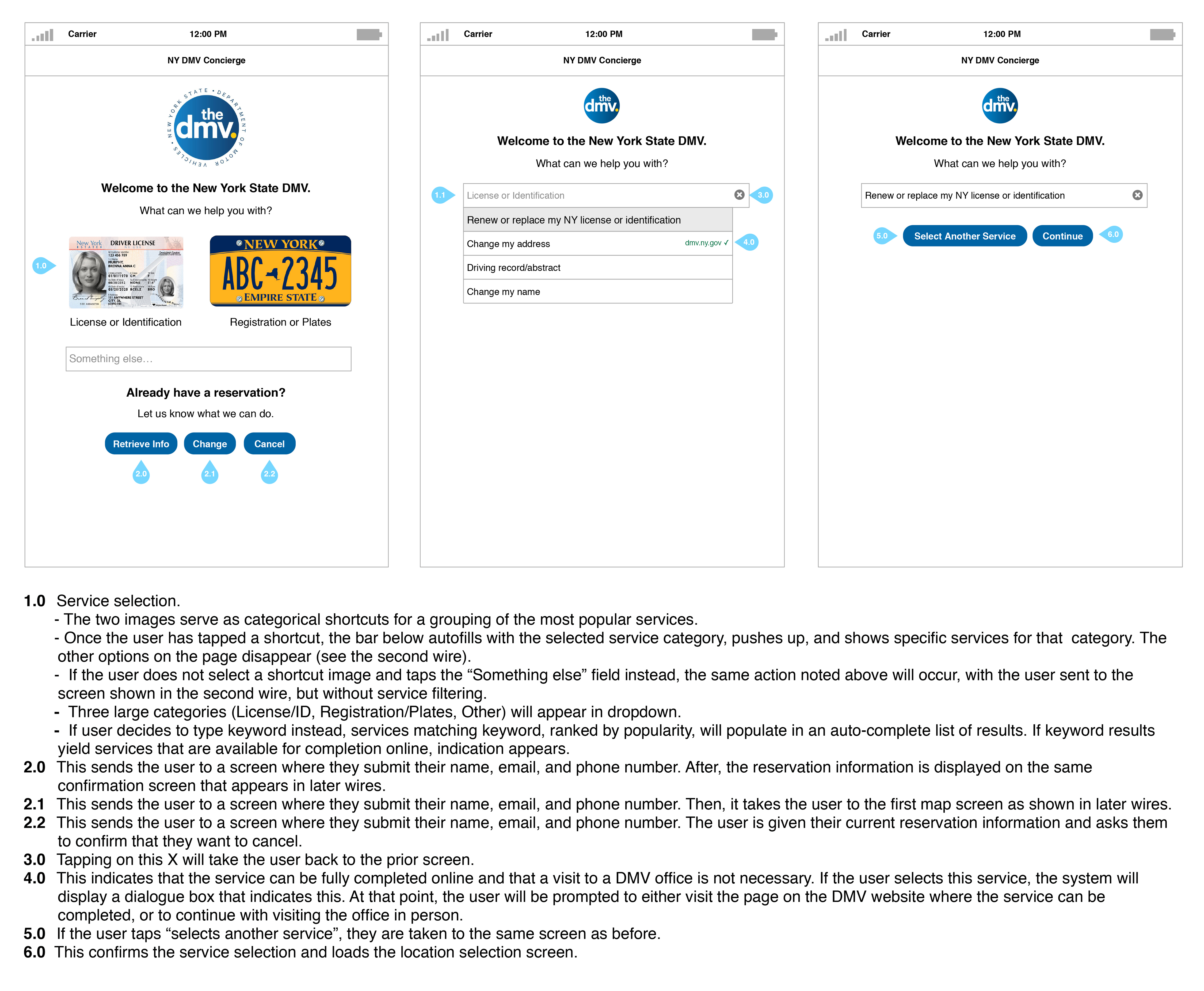
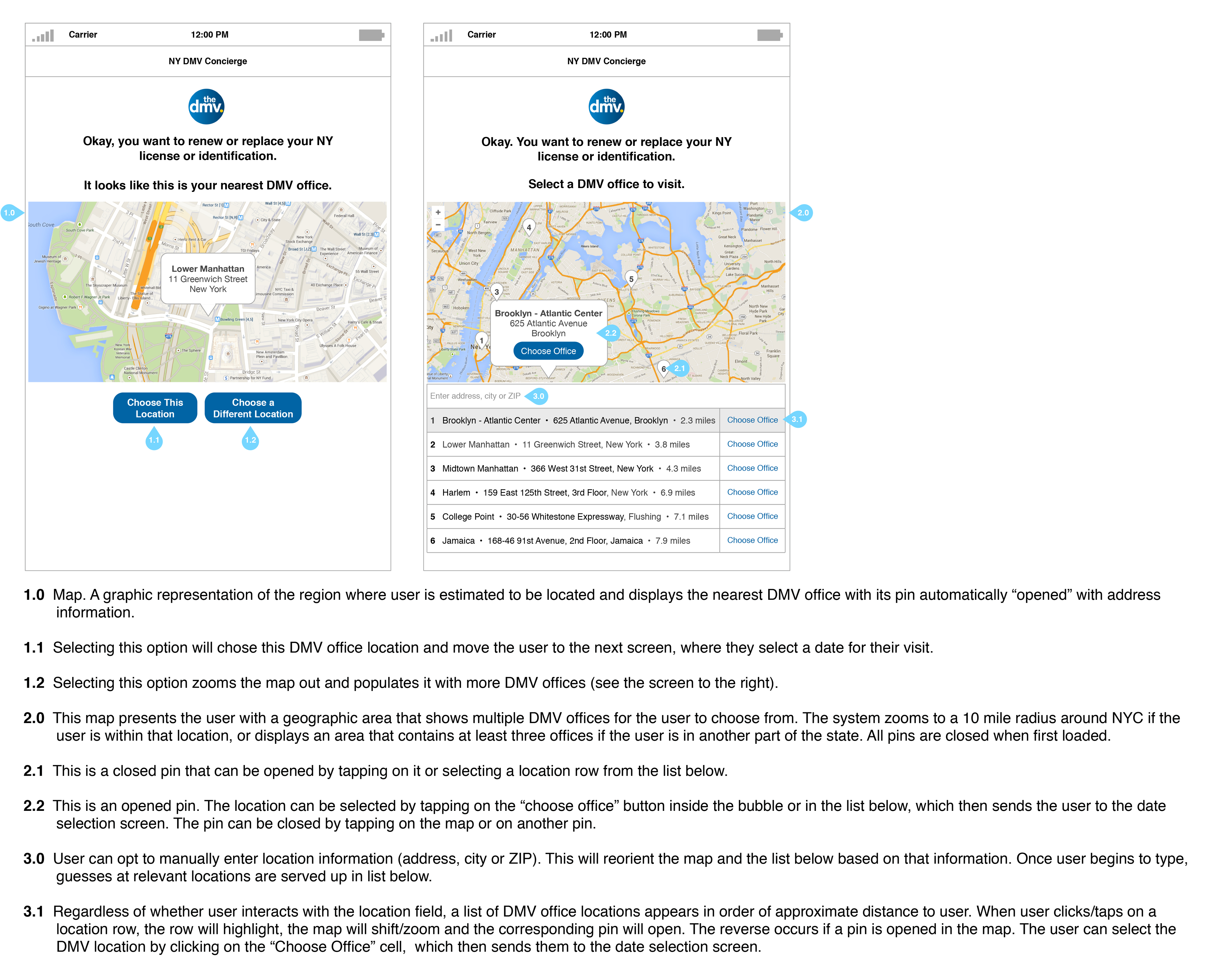
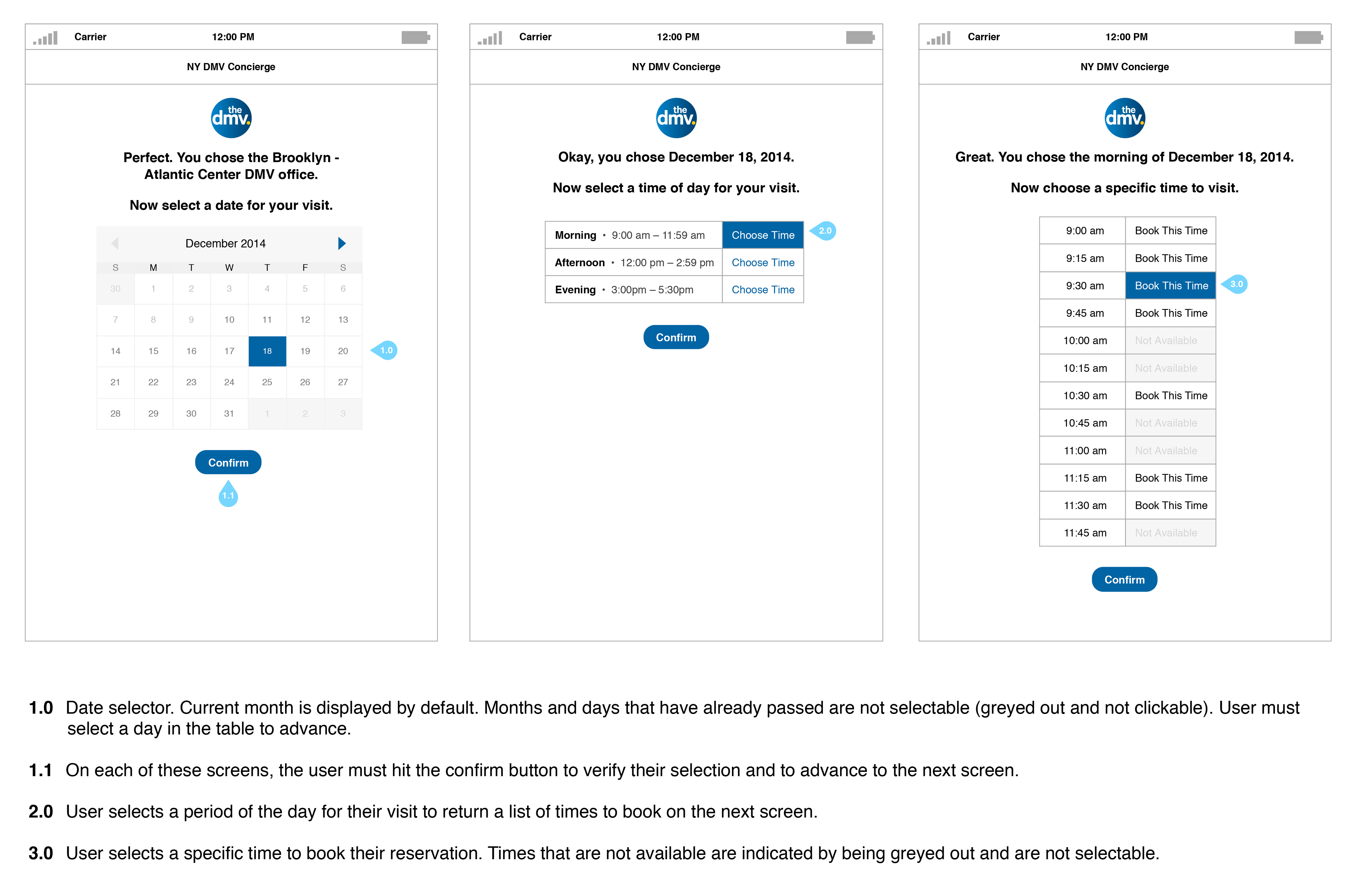
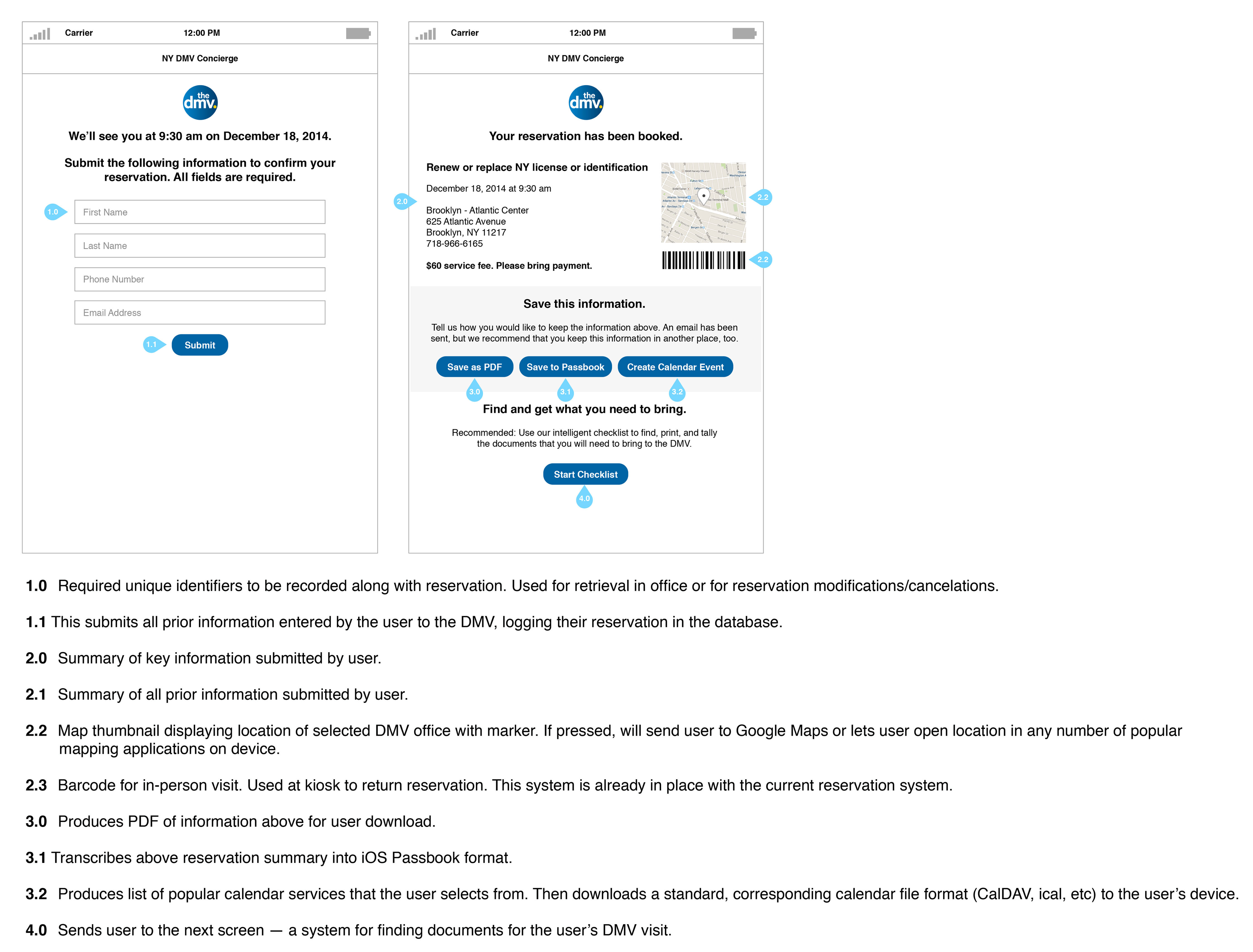
- which services the DMV offers online vs in-person
- which documents are needed for DMV services of interest
- where DMV offices are located
- when their DMV reservation is scheduled
By improving the app’s information architecture, navigation, forms, hierarchy, and structure, a clearer system with less friction could be produced. This would help New Yorkers get faster, easier access to the DMV services that they need, moving the DMV closer to its 90% customer satisfaction goal.
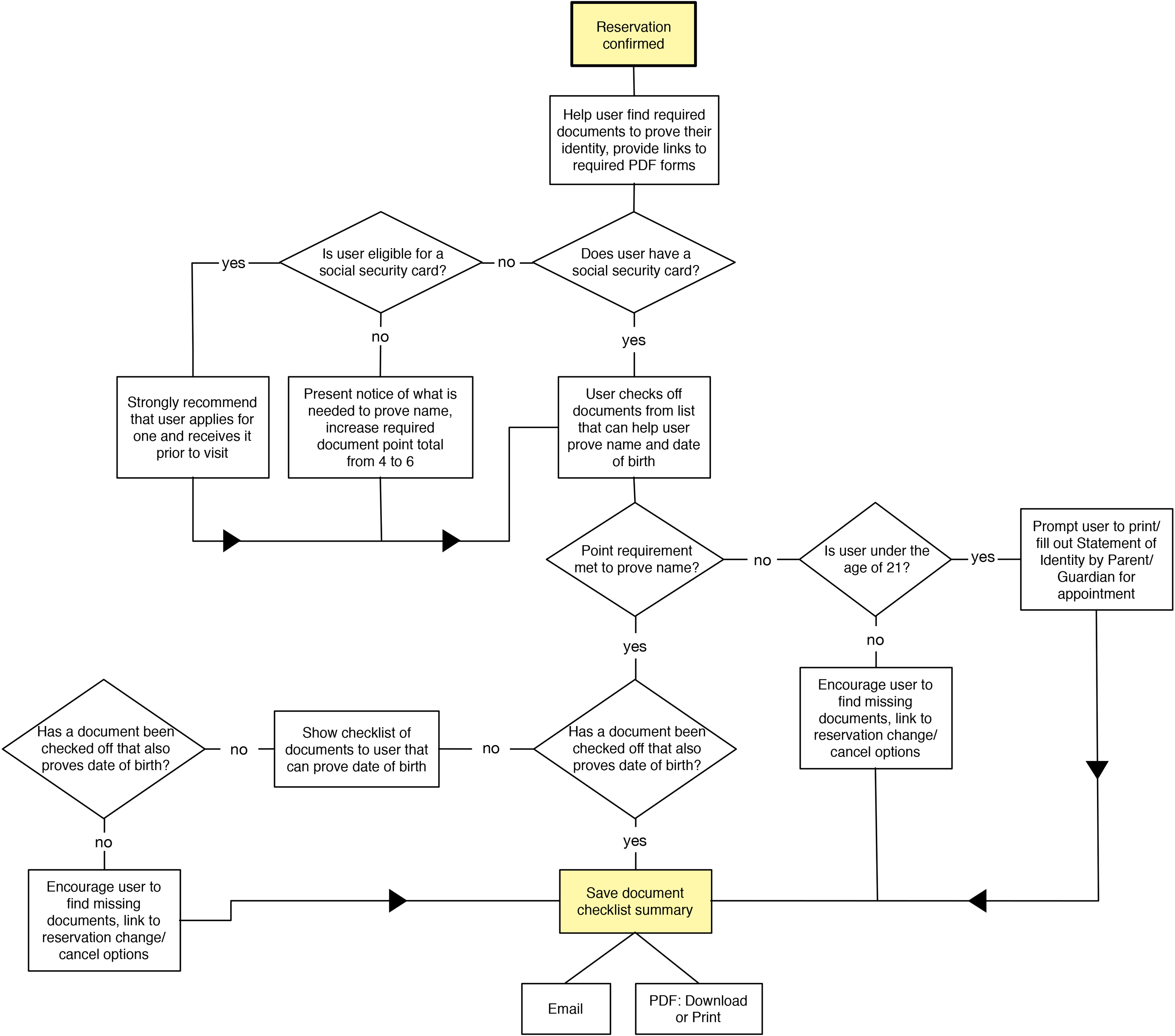
Complete User Flow
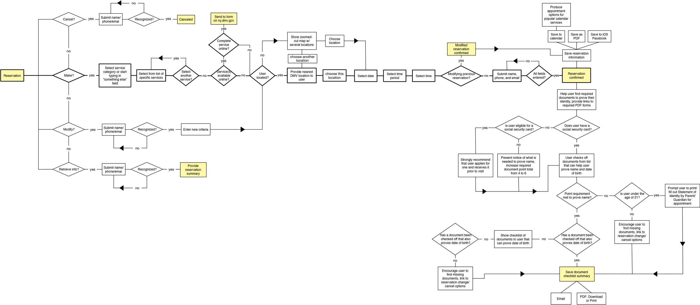
Primary User Flow
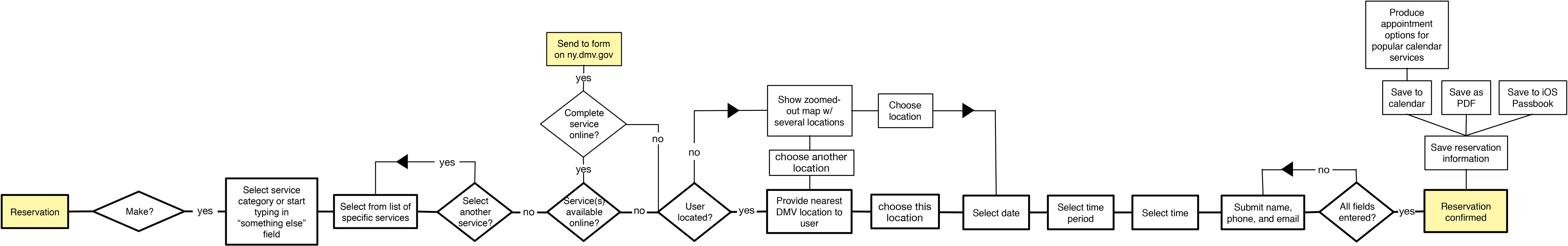
Secondary User Flow
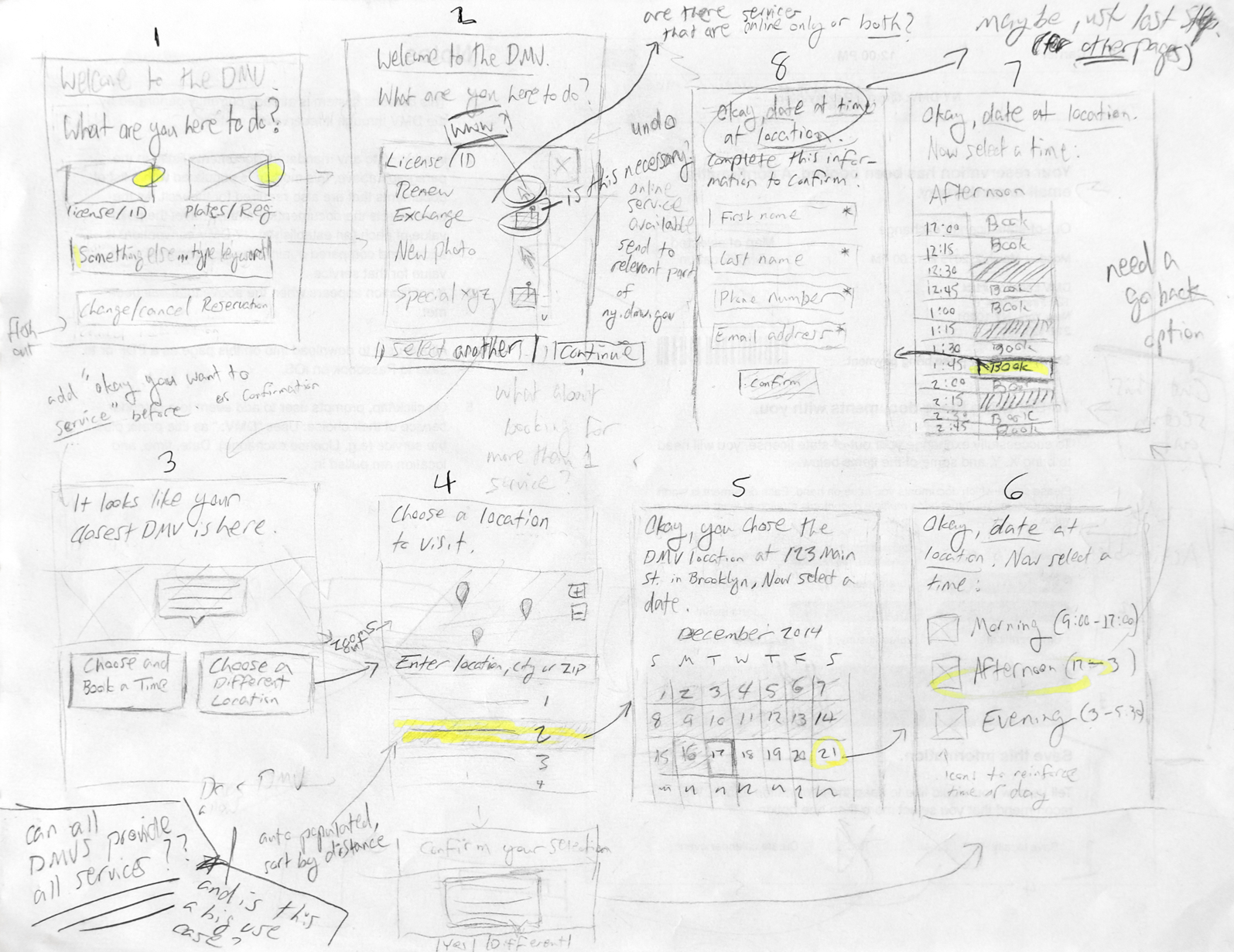
Wireframes – Early Sketches
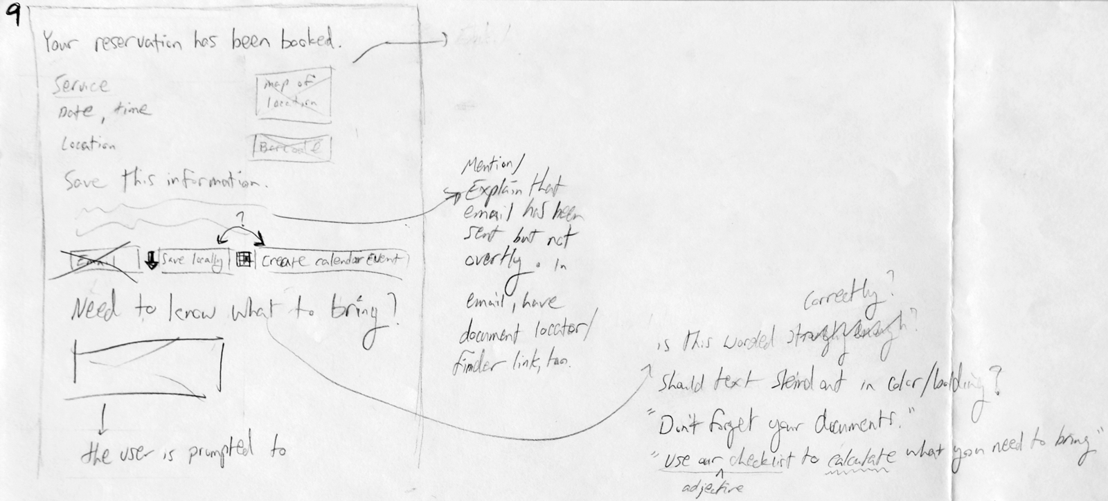
Final, Annotated Wireframes (no UI)